This is a Paragraph. Lorem ipsum dolor sit amet, consectetur adipisicing elit. Amet aperiam assumenda commodi consequuntur dolorem ea enim id in incidunt ipsum magni maiores minima nihil, obcaecati, officia reiciendis ullam ut, voluptates?
This is another Paragraph. Lorem ipsum dolor sit amet, consectetur adipisicing elit. Amet aperiam assumenda commodi consequuntur dolorem ea enim id in incidunt ipsum magni maiores minima nihil, obcaecati, officia reiciendis ullam ut, voluptates?
Heading One
This is a Paragraph. Lorem ipsum dolor sit amet, consectetur adipisicing elit. Amet aperiam assumenda commodi consequuntur dolorem ea enim id in incidunt ipsum magni maiores minima nihil, obcaecati, officia reiciendis ullam ut, voluptates?
Heading Two
This is a Paragraph. Lorem ipsum dolor sit amet, consectetur adipisicing elit. Amet aperiam assumenda commodi consequuntur dolorem ea enim id in incidunt ipsum magni maiores minima nihil, obcaecati, officia reiciendis ullam ut, voluptates?
Heading Three
This is a Paragraph. Lorem ipsum dolor sit amet, consectetur adipisicing elit. Amet aperiam assumenda commodi consequuntur dolorem ea enim id in incidunt ipsum magni maiores minima nihil, obcaecati, officia reiciendis ullam ut, voluptates?
Heading Four
This is a Paragraph. Lorem ipsum dolor sit amet, consectetur adipisicing elit. Amet aperiam assumenda commodi consequuntur dolorem ea enim id in incidunt ipsum magni maiores minima nihil, obcaecati, officia reiciendis ullam ut, voluptates?
Heading Five
This is a Paragraph. Lorem ipsum dolor sit amet, consectetur adipisicing elit. Amet aperiam assumenda commodi consequuntur dolorem ea enim id in incidunt ipsum magni maiores minima nihil, obcaecati, officia reiciendis ullam ut, voluptates?
Heading Six
This is a Paragraph. Lorem ipsum dolor sit amet, consectetur adipisicing elit. Amet aperiam assumenda commodi consequuntur dolorem ea enim id in incidunt ipsum magni maiores minima nihil, obcaecati, officia reiciendis ullam ut, voluptates?
Imitating Headers
Sometimes, usually for SEO reasons, you may not want to use a real header tag on some text that you want to look like a header. These classes make a span or a div look like an <h1>, <h2>, <h3>, or <h4>.
.h1 header look-a-like
.h2 header look-a-like
.h3 header look-a-like
.h4 header look-a-like
Font Size Modifiers
.font-size-huge
.font-size-xxxl
.font-size-xxl
.font-size-xl
.font-size-l
.font-size-m
.font-size-s
.font-size-xs
Font Family and Weight Modifiers
.font-family-base .font-weight-normal
.font-family-base .font-weight-semi-bold
.font-family-base .font-weight-bold
.font-family-serif .font-weight-normal
.font-family-serif .font-weight-bold
.font-family-light .font-weight-normal
.font-family-light .font-weight-bold
Buttons
Links as Buttons
Consider using real buttons. Proper markup/accessibility dictate links should navigate.
You can group forms into .form-blocks. .form-input default to 100% width, but you can use fixed width inputs like .form-input-100. You can also use the grid system for more complicated form layouts.
Use .form-input-inline to force form elements to their natural width.
All grids must be inside of at least one outer container element that has the class .contain on it. Containers help keep our maximum width on the site and provide padding for the outer edges of the screen. Most pages of our website are wrapped inside of a container. To use the grid system, all you need is one outer container somewhere in the HTML structure above your grid in the tag heirarchy.
This is not in a container
This is in a container
<div class="contain"> <p>This is in a container</p> </div>
The Grid
col-tablet-landscape-1
col-tablet-landscape-1
col-tablet-landscape-1
col-tablet-landscape-1
col-tablet-landscape-1
col-tablet-landscape-1
col-tablet-landscape-1
col-tablet-landscape-1
col-tablet-landscape-1
col-tablet-landscape-1
col-tablet-landscape-1
col-tablet-landscape-1
col-tablet-landscape-2
col-tablet-landscape-2
col-tablet-landscape-2
col-tablet-landscape-2
col-tablet-landscape-2
col-tablet-landscape-2
col-tablet-landscape-3
col-tablet-landscape-3
col-tablet-landscape-3
col-tablet-landscape-3
col-tablet-landscape-4
col-tablet-landscape-4
col-tablet-landscape-4
col-tablet-landscape-5
col-tablet-landscape-7
col-tablet-landscape-6
col-tablet-landscape-6
col-tablet-landscape-7
col-tablet-landscape-5
col-tablet-landscape-8
col-tablet-landscape-4
col-tablet-landscape-9
col-tablet-landscape-3
col-tablet-landscape-10
col-tablet-landscape-2
col-tablet-landscape-11
col-tablet-landscape-1
No Gutter Grid
col-tablet-landscape-4
col-tablet-landscape-4
col-tablet-landscape-4
col-tablet-landscape-2
col-tablet-landscape-2
col-tablet-landscape-2
col-tablet-landscape-2
col-tablet-landscape-2
col-tablet-landscape-2
Offsets
col-tablet-landscape-offset-2
col-tablet-landscape-offset-4
col-tablet-landscape-offset-6
col-tablet-landscape-offset-8
col-tablet-landscape-offset-10
Wrapping
col-tablet-landscape-4
col-tablet-landscape-4
Lots more content causing the text to wrap to another line.
col-tablet-landscape-4
col-tablet-landscape-4
Flexible Columns
You can use the col classes without specifying the size of the column to make a stretchy column that will grow to fill out the row it is on
col-tablet-portrait
col-tablet-landscape-1 col-tablet-portrait-6
Flexible and Auto Columns
Mixing flexible and auto columns you can create grids based on the content size of the auto columns.
col-tablet-portrait
col-tablet-portrait-auto
Reverse Order
Reverse tablet-portrait and below
1
2
3
Reverse tablet-portrait and above
1
2
3
Large Gutter Grids
These grids have larger gutters on the tablet-landscape viewport and lager
1
2
3
Grids with a bottom gutter (for wrapping grid items)
1
2
3
1
2
3
Pulls (Floats)
.pull-right-tablet-landscape-above
Lorem ipsum dolor sit amet, consectetur adipisicing elit. Accusantium alias amet aspernatur at esse harum labore laudantium maxime nostrum nulla porro quidem repellendus reprehenderit sapiente sit tenetur totam velit, vitae!
.pull-left
Lorem ipsum dolor sit amet, consectetur adipisicing elit. Accusantium alias amet aspernatur at esse harum labore laudantium maxime nostrum nulla porro quidem repellendus reprehenderit sapiente sit tenetur totam velit, vitae! Lorem ipsum dolor sit amet, consectetur adipisicing elit. Accusantium alias amet aspernatur at esse harum labore laudantium maxime nostrum nulla porro quidem repellendus reprehenderit sapiente sit tenetur totam velit, vitae! Lorem ipsum dolor sit amet, consectetur adipisicing elit. Accusantium alias amet aspernatur at esse harum labore laudantium maxime nostrum nulla porro quidem repellendus reprehenderit sapiente sit tenetur totam velit, vitae!
.pull-right
Lorem ipsum dolor sit amet, consectetur adipisicing elit. Accusantium alias amet aspernatur at esse harum labore laudantium maxime nostrum nulla porro quidem repellendus reprehenderit sapiente sit tenetur totam velit, vitae! Lorem ipsum dolor sit amet, consectetur adipisicing elit. Accusantium alias amet aspernatur at esse harum labore laudantium maxime nostrum nulla porro quidem repellendus reprehenderit sapiente sit tenetur totam velit, vitae!
Text Alignment Helpers
.align-center
.align-left
.align-right
Responsive Alignment
.align-center-tablet-landscape-above
.align-right-tablet-portrait-below
Margin Helpers
.no-margin
.no-margin-bottom
.no-margin-top
.no-leading (no margin top or bottom)
.margin-top-5
.margin-top-10
.margin-top-20
.margin-top-40
.margin-top-60
.margin-bottom-5
.margin-bottom-10
.margin-bottom-20
.margin-bottom-40
.margin-bottom-60
.margin-left-5
.margin-left-10
.margin-left-20
.margin-left-40
.margin-left-60
.margin-right-5
.margin-right-10
.margin-right-20
.margin-right-40
.margin-right-60
Banners
The main components of the banner are the wrapping .banner <div>, the .banner-image (usually an <img> tag), and the .banner-content <div>.
For more complicated layouts that change at different breakpoints you can use the HTML 5 <picture> or the <img> srcset attribute to display different images at different breakpoints.
You can also use the grid system to move the banner content around.
1 Ayurvedic Medicine: The Principles of Traditional Practice by Sebastion Pole, Chapter 6: Herb Bhumiamalki pg 143-144 and Ayurvedic Healing: A Comprehensive Guide by Dr. David Frawley pg 141-142
2 Ayurvedic Medicine: The Principles of Traditional Practice by Sebastion Pole, Chapter 6: Herb; Neem pg 233-243
<p><sup><a href="#one">1</a></sup> Ayurvedic Medicine: The Principles of Traditional Practice by Sebastion Pole, Chapter 6: Herb Bhumiamalki pg 143-144 and Ayurvedic Healing: A Comprehensive Guide by Dr. David Frawley pg 141-142</p> <p><sup><a href="#two">2</a></sup> Ayurvedic Medicine: The Principles of Traditional Practice by Sebastion Pole, Chapter 6: Herb; Neem pg 233-243</p>
Article Callout
Be creative, yet centered. Be courageous, with discrimination. Be compassionate, without attachment.
<div class="article-callout"> CALLOUT TEXT </div>
Inline Article Callout
Every pitta dominant individual needs time for self-care.
After your morning cleansing routines, you head over to your local gym for some swimming. Staying out of the midday heat is vital for protecting your sensitive skin, and the cool water while swimming allows you to get some gentle aerobic activity into your exercise routine. After your workout, you head out to meet your friend for lunch. While you still love salads, you know that having warm cooked greens is better for pitta digestion. You even have some yummy grains like quinoa mixed with sweet potatoes and cooked beets to make sure your meal is balanced and offers a source of healthy protein. Knowing that alcohol will add to the drying and heating quality of pitta agni you finish your meal with a lovely cup of Cumin, Coriander, Fennel Tea (CCF).
<div class="inline-article-callout"> CALLOUT TEXT </div>
Article Callout Textblock
There are many nontraditional routes for building a family, including donor eggs and in vitro fertilization, that some of your individual situations may call for. In those cases, jump in and out along the series of steps as appropriate. Even in the case of adoption, most of these steps still apply since the cleansing and building also serve the spiritual and emotional preparation that is common to all routes.
<div class="article-callout-textblock"> CALLOUT TEXT </div>
Article Quote
“It is wisdom to know others; It is enlightenment to know one's self.”— Lao-Tzu
DISCLAIMER The information provided in this article is not intended as a substitute for medical advice, but only to apprise the reader of basic Ayurvedic lifestyle information. The advice of a qualified health professional is recommended before making changes in diet or exercise routines.
<p class="article-disclaimer"><strong>DISCLAIMER</strong> OTHER TEXT</p>
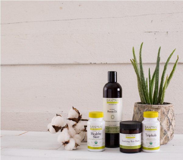
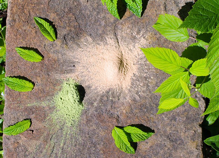
Photo Caption
Neem and Amalaki powders
<div class="photo-caption"> CAPTION TEXT </div>
Video Caption
Dr. Premal Patel, Wellness Director at Banyan Botanicals, talks cleansing, Ayurveda, and the benefits of Kitchari Spice Mix
<div class="video-caption">CAPTION TEXT</div>
Alphabetic Lists
A brisk 30 minute walk at least 4–5 times a week
Counseling on kapha pacifying lunch items that she could carry with her in the car
Drink less water so she doesn’t have to wake up to urinate
Kapalabhati Pranayama
Add 1 teaspoon of turmeric to her diet daily
<ol class="alpha-list"> <li>ITEM</li> </ol>
Gray Callout
This is the gray callout. As you can see it makes a gray box.
CTA tokens allow you to embed a link into an ee content area. It won't get rendered on AMP pages. These will also float right and stick out into the whitespace on the right of articles on larger viewports
The orientation attribute is optional. "vertical" is the default.
The style attribute is optional. allowed values are: action (orange), normal (dark gray blue), alternate (bright blue), if you don't specify style you get the default light gray background.
Elements that stick out of EE content areas
The images in the sample copy below stick out of the side of EE content areas in the desktop viewport and higer. For CTAs use the tokens mentioned above.
Header
Lorem ipsum dolor sit amet, consectetur adipiscing elit, sed do eiusmod tempor incididunt ut labore et dolore magna aliqua. Ut enim ad minim veniam, quis nostrud exercitation ullamco laboris nisi ut aliquip ex ea commodo consequat. Duis aute irure dolor in reprehenderit in voluptate velit esse cillum dolore eu fugiat nulla pariatur. Excepteur sint occaecat cupidatat non proident, sunt in culpa qui officia deserunt mollit anim id est laborum.
We've got a token to add a quiz to an ee content field
<!--bb:mini_quiz { "title": "Agni Quiz", "result_title": "Your score for each type:", "questions": [ { "text": "How has your appetite been this past week?", "answers": [ { "text": "Variable, sometimes I forget to eat", "result_id": "vishama", "points": 1 }, { "text": "I like to eat but not always hungry", "result_id": "manda", "points": 1 }, { "text": "I get \"hangry\" if I skip meals", "result_id": "tikshna", "points": 1 }, { "text": "I eat when I'm hungry at regular meal-times", "result_id": "sama", "points": 1 } ] }, { "text": "Have you recently noticed any of these feelings after eating?", "answers": [ { "text": "Gassy or bloated", "result_id": "vishama", "points": 1 }, { "text": "Heartburn or sharp sensations in my belly", "result_id": "tikshna", "points": 1 }, { "text": "Heavy or sleepy", "result_id": "manda", "points": 1 }, { "text": "None of the above", "result_id": "sama", "points": 1 } ] }, { "text": "How often do you have an elimination?", "answers": [ { "text": "It’s inconsistent. Regularly and then not at all", "result_id": "vishama", "points": 1 }, { "text": "Several times a day, often 3+", "result_id": "tikshna", "points": 1 }, { "text": "Not every day", "result_id": "manda", "points": 1 }, { "text": "About 1-3x per day", "result_id": "sama", "points": 1 } ] }, { "text": "How would you describe your stools?", "answers": [ { "text": "Basically rabbit pellets", "result_id": "vishama", "points": 1 }, { "text": "Loose and explosive", "result_id": "tikshna", "points": 1 }, { "text": "Heavy and dark", "result_id": "manda", "points": 1 }, { "text": "It varies between hard and loose", "result_id": "vishama", "points": 1 }, { "text": "None of the above", "result_id": "sama", "points": 1 } ] }, { "text": "Lately I've been noticing some emotions of", "answers": [ { "text": "Anxiousness and fear", "result_id": "vishama", "points": 1 }, { "text": "Calm and contentedness", "result_id": "sama", "points": 1 }, { "text": "Anger and irritability", "result_id": "tikshna", "points": 1 }, { "text": "Lethargy and attachment", "result_id": "manda", "points": 1 } ] } ], "results": [ { "id": "sama", "url": "/info/blog-the-banyan-insight/details/agni-quiz/#sama", "title": "Sama", "description": "This agni represents balance" }, { "id": "tikshna", "url": "/info/blog-the-banyan-insight/details/agni-quiz/#tikshna", "title": "Tikshna", "description": "The pitta type agni" }, { "id": "vishama", "url": "/info/blog-the-banyan-insight/details/agni-quiz/#vishama", "title": "Vishama", "description": "The vata type agni" }, { "id": "manda", "url": "/info/blog-the-banyan-insight/details/agni-quiz/#manda", "title": "Manda", "description": "The kapha type agni" } ] }-->
Disclosure Widgets
Show More / Show Less / Expander
You can use the below code to trigger the visibility of content. Use any other classes to help stylize how you want.
Ayurvedic Teas and Drink Mixes
When we think of healthy lifestyle practices, taking herbs may be at the top of the list. What better way than to enjoy Ayurvedic teas and herbal drink mixes?
In Ayurveda, one of the most traditional ways to take herbs is to mix them in a warm drink. In fact, the liquid itself is an important component: Ayurveda regards warm water, milk, and other liquids as powerful anupans, or carrier substances, that bring herbs deeper into the tissue layers of the body. So not only do these drinks taste good—they’re also providing a deeper level of support.
What Is an Ayurvedic Tea?
An Ayurvedic tea is an herbal tea that is mindfully created with the wisdom of Ayurvedic herbalism. Usually, Ayurvedic teas are prepared to achieve a specific effect in the body, such as to promote healthy sleep patterns, offer natural immune support, or strengthen digestion. Ayurvedic teas are created with the intention of balancing one or more of the doshas (vata, pitta, and kapha) and achieve this goal by blending a synergistic combination of supportive herbs.
Our CCF Tea Blends
CCF Tea is one of the most beloved drinks for digestion in Ayurveda. The acronym “CCF” stands for its ingredients of cumin, coriander, and fennel seeds, each of which plays a role in promoting healthy digestion while encouraging subtle detoxification and gentle cleansing.
Our Herbal Drink Mixes
Like our CCF Tea line, our powdered drinks blend herbs and spices into delicious Ayurvedic herbal drinks. These beverages combine herbal adaptogens with the right amount of digestive spices, creating tonics that are a crave-worthy yet guilt-free way to satisfy your tastebuds while nourishing your body.
Our Commitment to Quality and Sustainability
<div class="disclosure-widget"> <div class="disclosure-summary"> The summary content </div> <div class="disclosure-details"> The detail content </div> <div class="disclosure-actions"> <button class="toggle" data-toggle-text="Show Me Less">Show Me More</button> </div> </div>